The Psychology of Colour
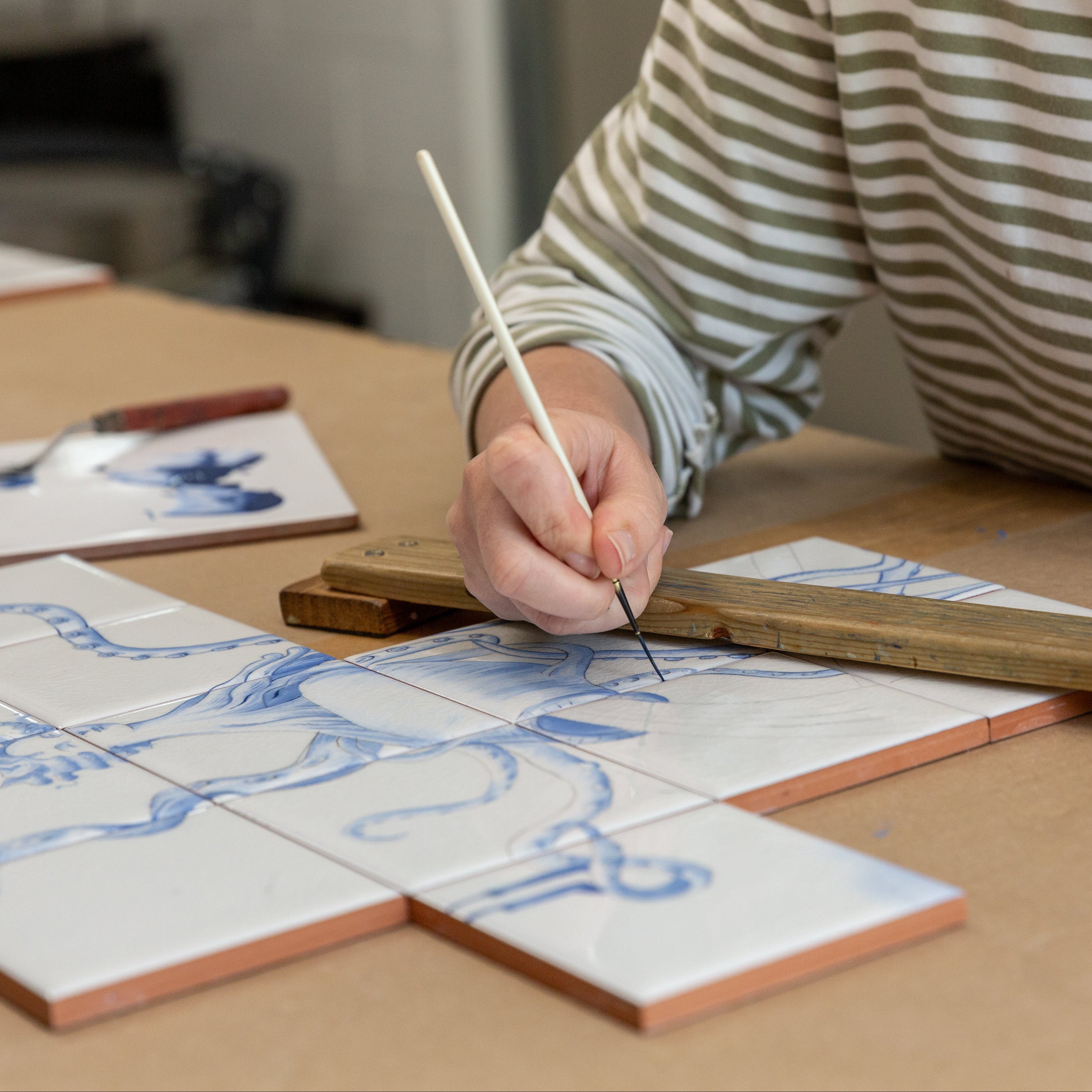
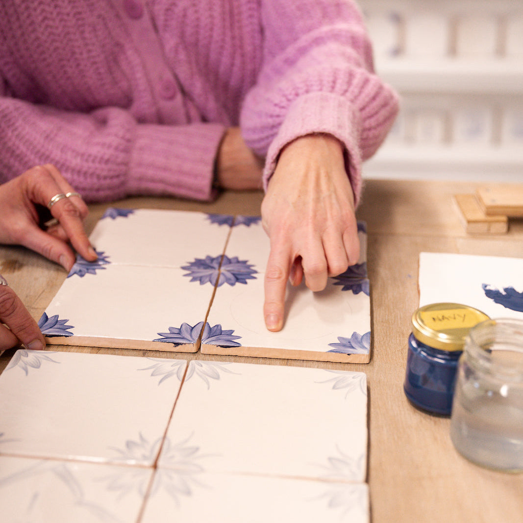
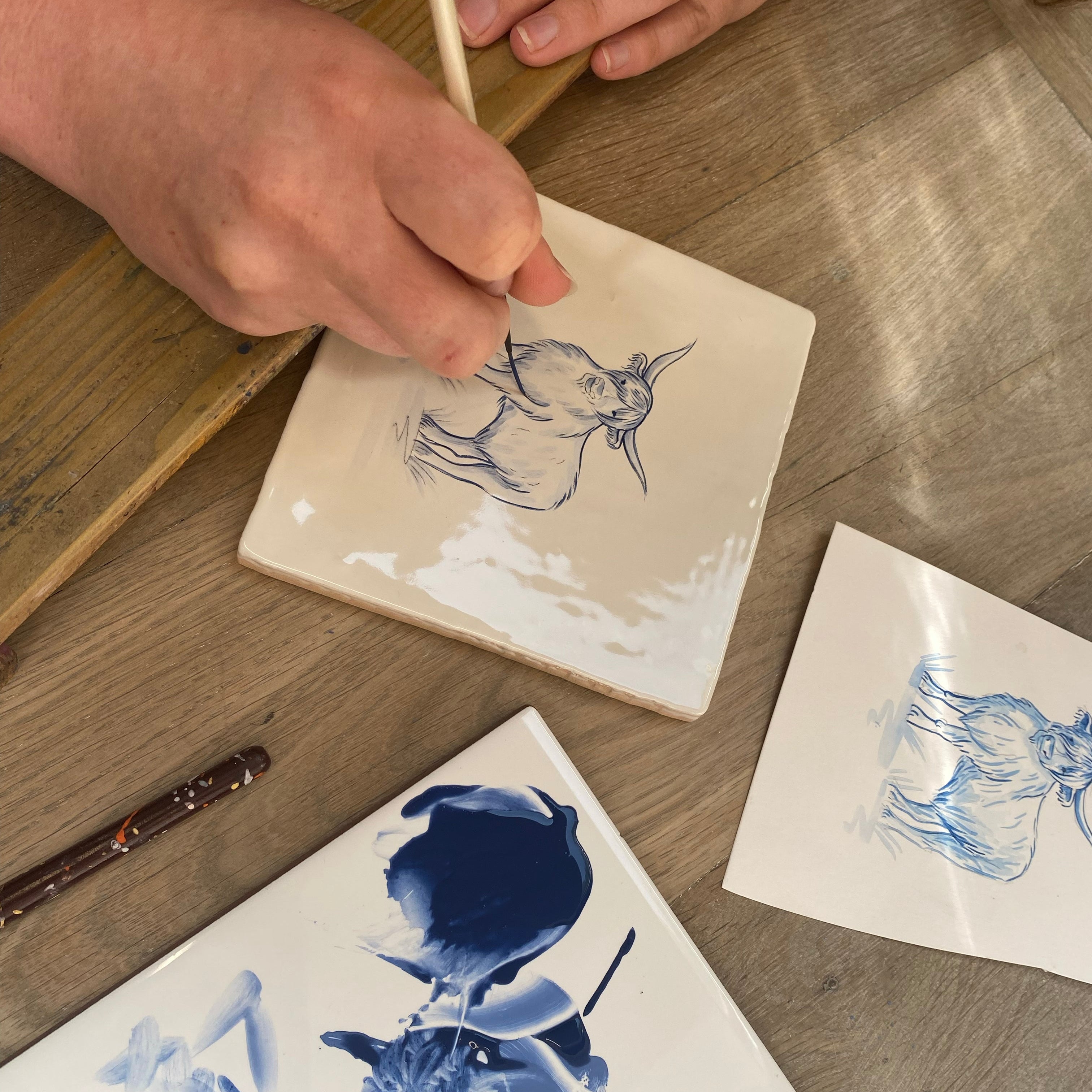
Colour is at the heart of everything we do at Decorum. Our Delfts wouldn’t be Delft without the gorgeous Royal Blue, our Arcs wouldn’t pop were it not for the Citrus and the entire Plain Sailing collection would be… completely plain.
We understand the power of colour like so many artists, designers and healers before us – as the artist Gaugin said, “Colour! What a deep and mysterious language, the language of dreams.”
As it is such an important part of everyone’s lives, we thought we’d take a look into the emotional, cultural and psychological impact of colour.

Colour has been a source of fascination for as far back as we can trace human history. Prehistoric cave paintings experiment with yellow, ochre and red pigments. The Egyptian Pharaohs believed that certain colours had particular links to the gods – red reflected the fury of hostile gods such as Seth of Apophis, but was also a reflection of the land, victory and life itself. The ancient Greeks revered purple above all other colours because the process to create purple dye was almost more expensive than gold – even in 16th century England, only the king was allowed to wear purple as it was considered so precious.
During the late seventeenth century, Sir Isaac Newton discovered how to split light and realised that the ‘white’ light we see is actually a spectrum. He also realised that each colour, shade and tone is created by a slightly different wavelength – research that eventually led to Newton creating the first ever colour wheel in 1704.
In the early twentieth century, Swiss psychiatrist Carl Jung studied the effects of colour on the human mind which led him to develop a form of colour therapy that allowed his patients to express themselves with colours and images.
Today colour and art therapy are universally recognised as powerful tools for healing and recovery – allowing individuals to express themselves in a way that doesn’t require language or words, but taps into a more basic, unfiltered set of emotions and feelings.

Our reaction to a given colour is deeply personal and often rooted in the culture we grew up in. The ancient Greeks, Chinese, Japanese and Hebrews did not have a name for blue and thought of it as a variation of green. Even today several cultures blur together blue and green, including Korean, Vietnamese, Thai and Kurdish. Another example of this is that in Western cultures, black tends to be the colour used for mourning, whereas in Eastern cultures white is used to mourn a loved one – the very colour used in the west to celebrate a wedding!
That being said, there are some feelings or reactions to colours that are (almost) universal.
A study in 2020 that surveyed the emotional associations to colour of 4,598 people from 30 different countries found that people often link a given colour to a given emotions. 52% of respondents associated yellow with joy, whilst 68% linked red to love – regardless of where they’re from or their cultural background.
These associations can be a powerful tool for designers and marketers -
In an appropriately titled study called Impact of Color in Marketing, researchers found that up to 90% of snap judgments made about products were based on colour alone (depending on the product).

This a reminder of how important our surroundings are to us. Those snap judgements we mentioned also apply to rooms and places.
Artists and interior designers have long said that the colours you surround yourself with can have a profound effect on your mood. One study in America found that Americans spend 90% of their time inside man-made spaces. We’re not scientists, but that’s a lot of time. Although this figure will vary from place to place and person to person, it just shows how much of an impact the interiors we live in have on our wellbeing.
Research done by Turkish academics used digitally altered images of the same living room – one to show the room in “warm” colours (reds, terracottas, deep orange), another to show the same room in “cool” colours (blues, creams) and the last one using achromatic colours (white, black and grey). The image of the cooler toned room made people feel more relaxed and restful whilst the warmer toned room gave people more energy and motivation.
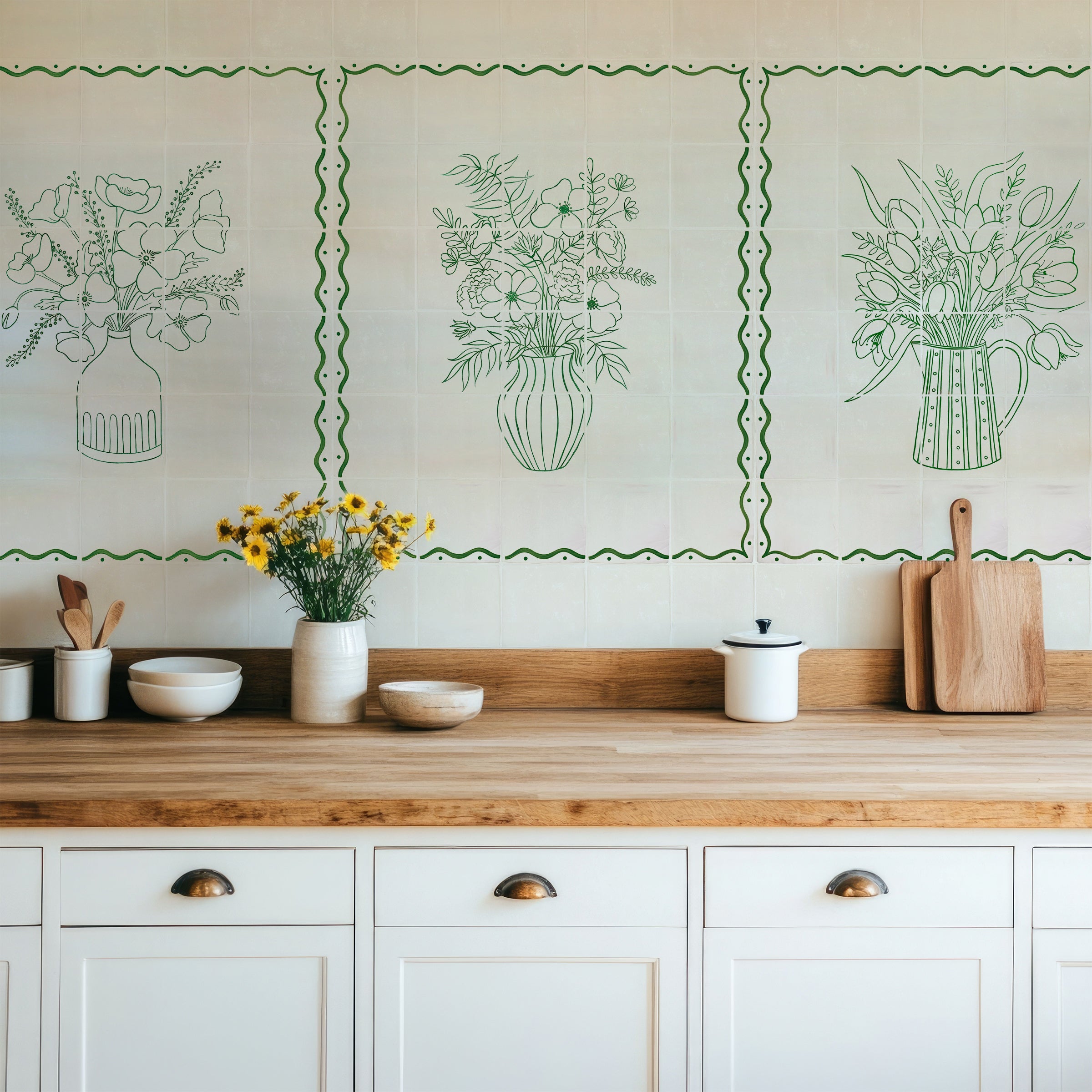
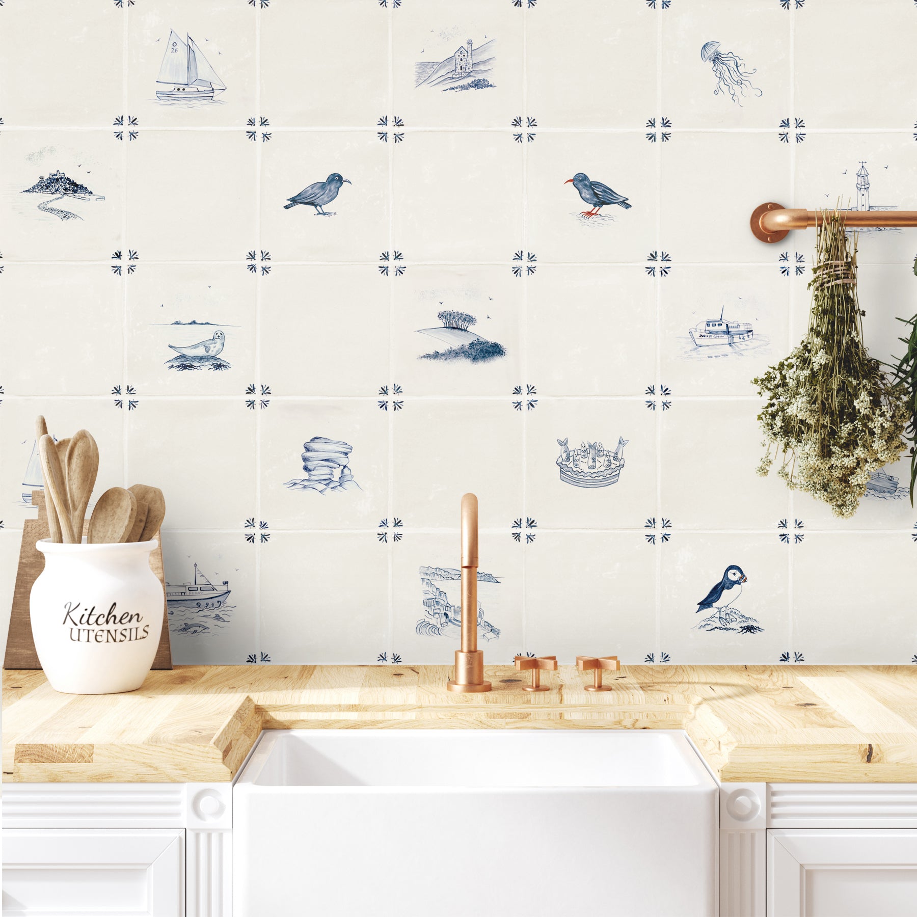
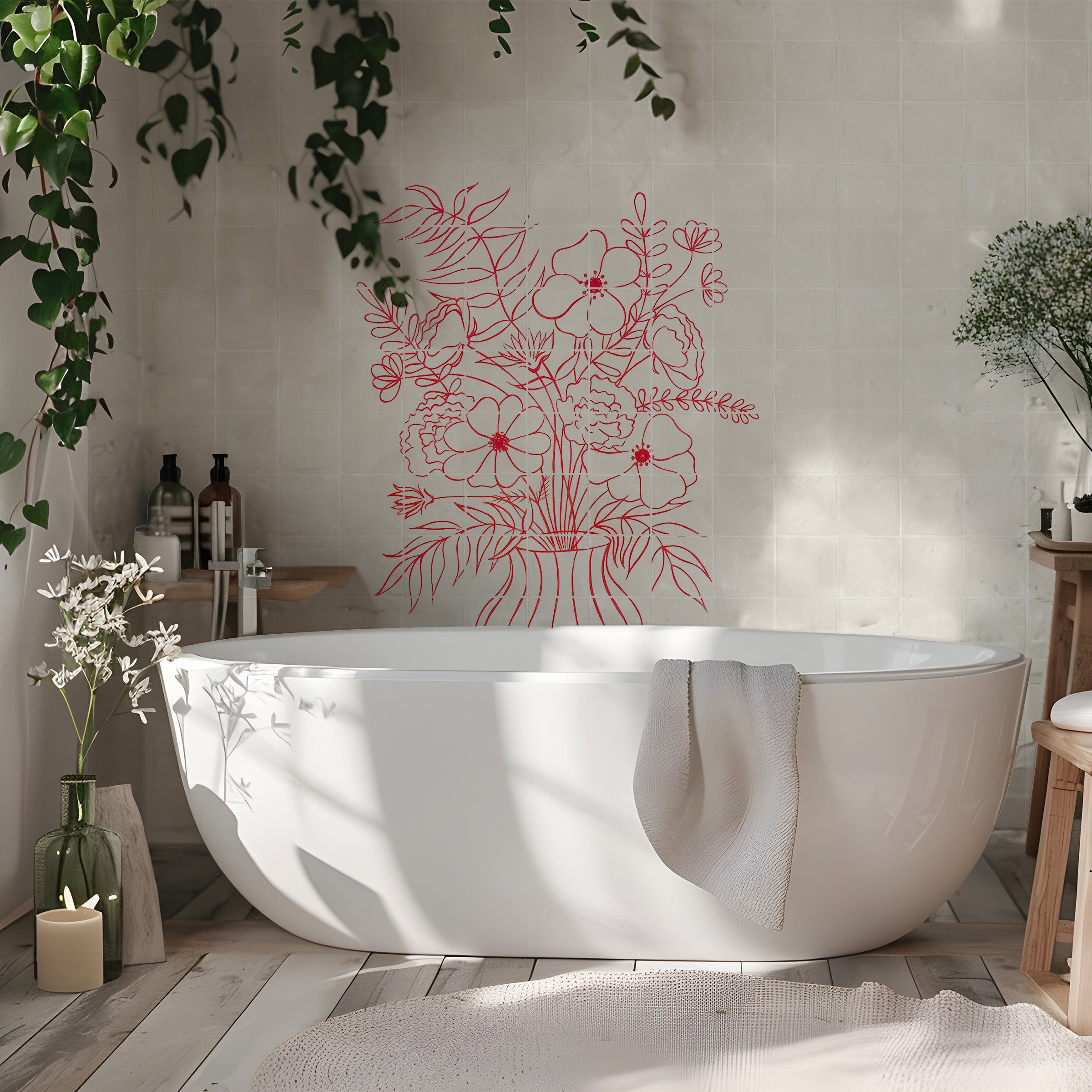
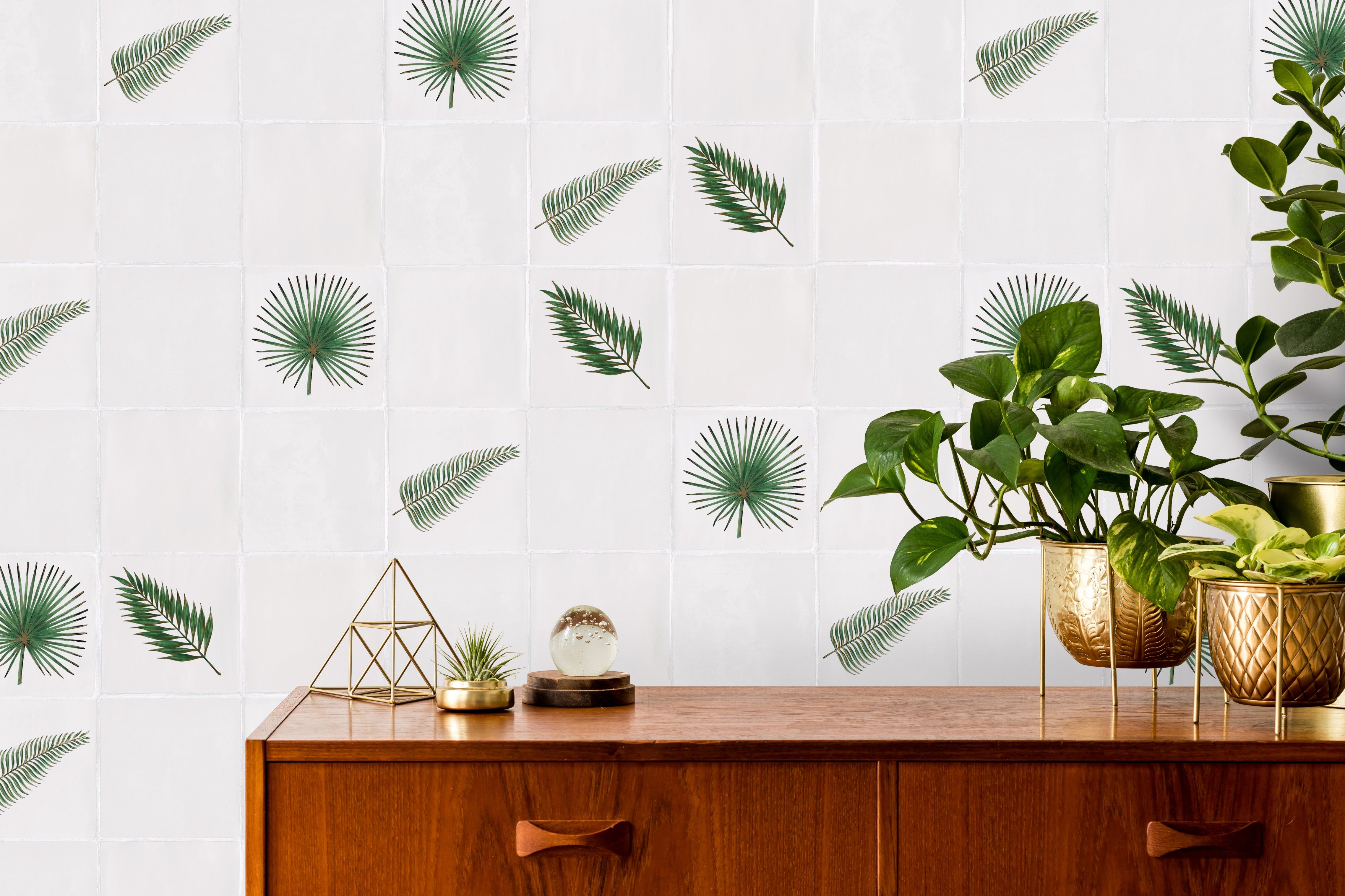
We like to think our tiles form an important part of how our customers feel when they’re at home. We often receive orders for an Arc Lemon or Citrus because a customer is looking to make their kitchen feel fun and welcoming. Our Signals in Topaz and Teal, or our blue and white delfts, are just as often ordered for bathrooms as they create such a calming atmosphere.

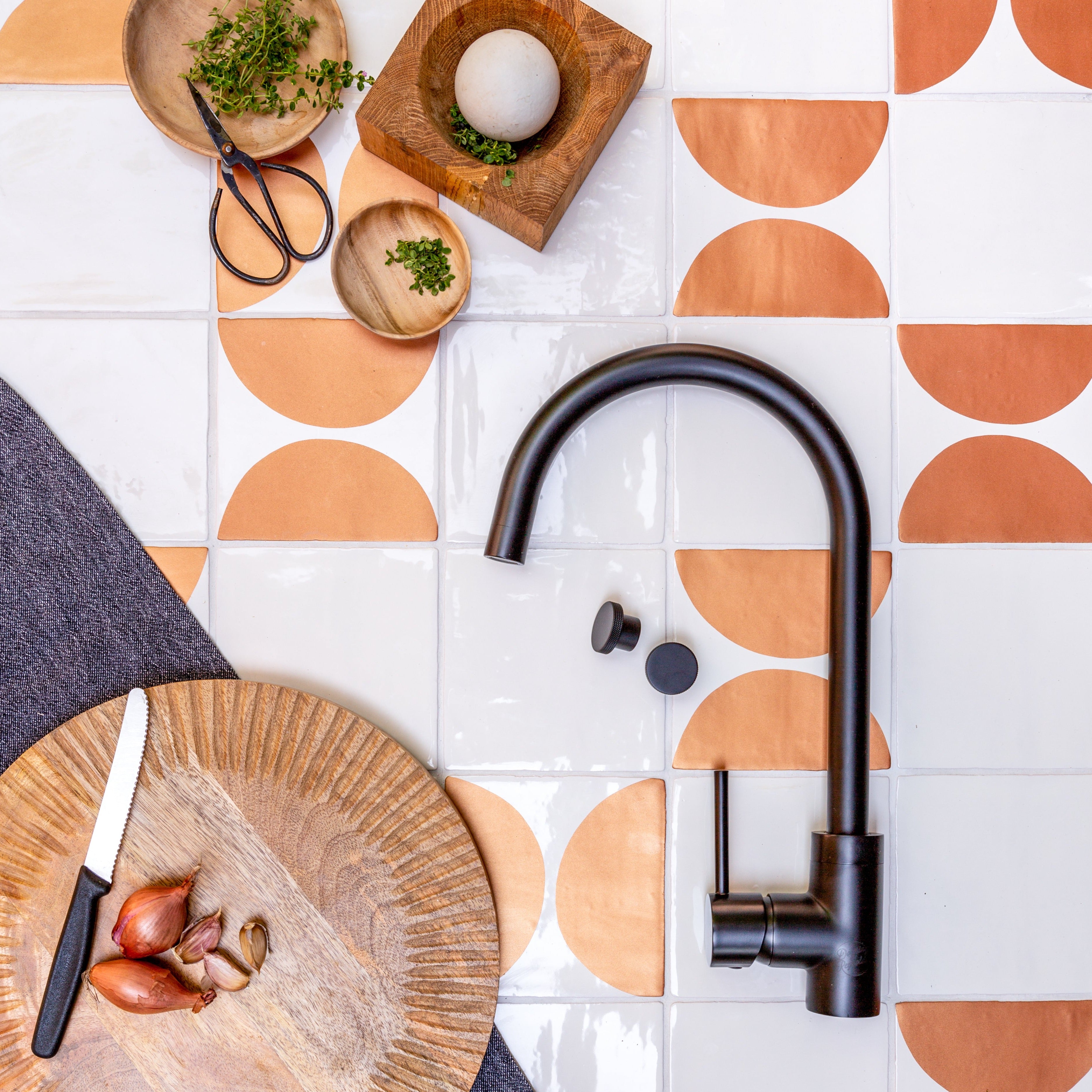
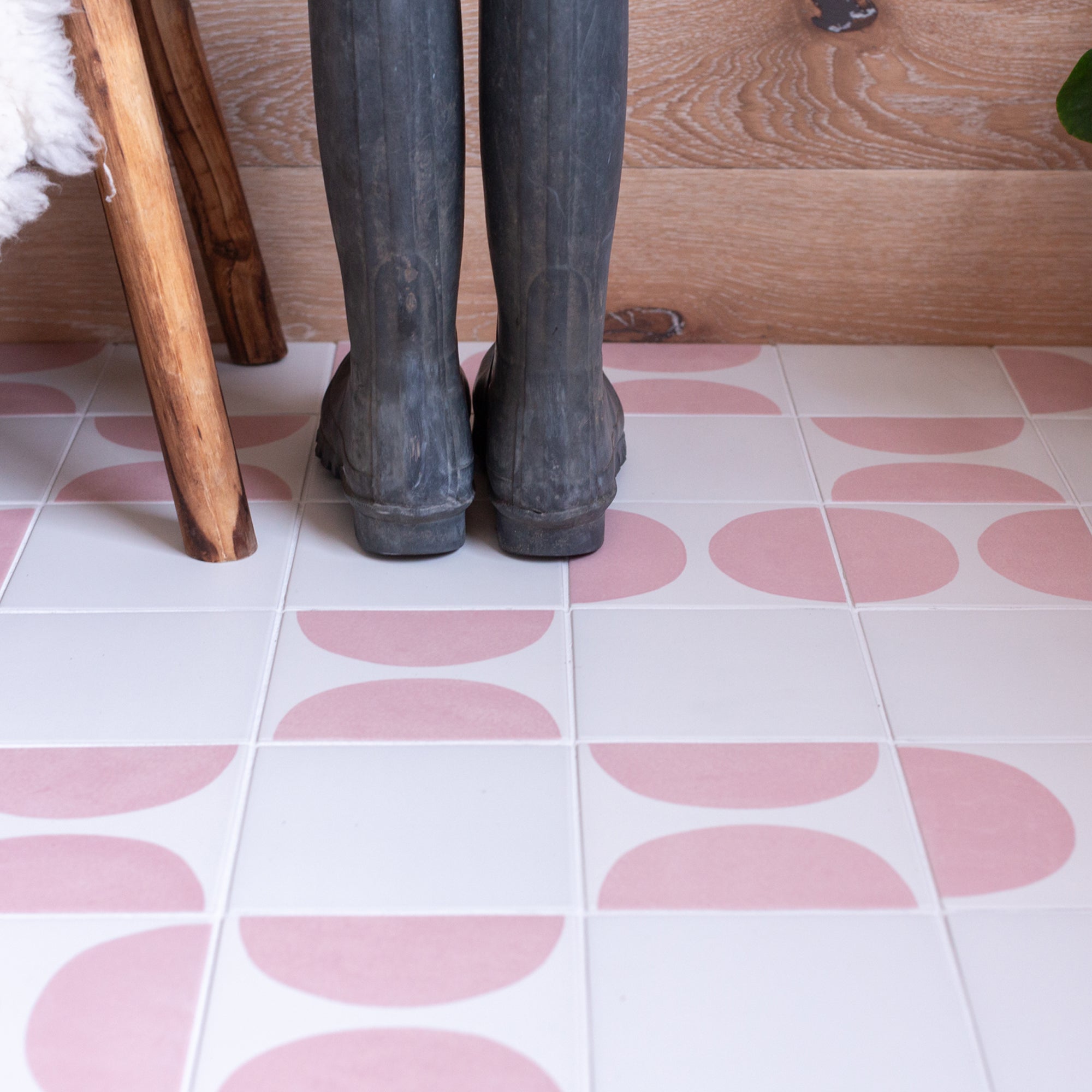
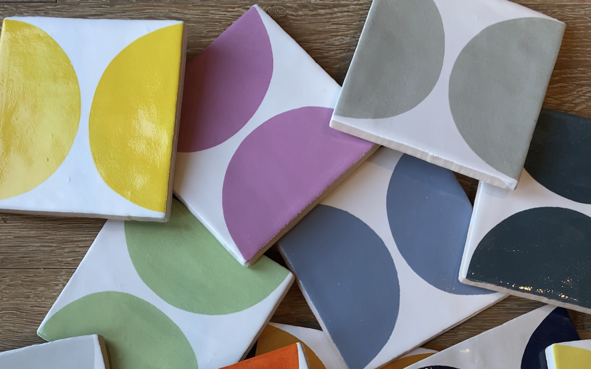
That being said we also try to experiment with colour and offer shades or combinations that are more unexpected. Our Drift collection includes tiles decorated in both orange and grey, green and pink – or the Colour Blends range combines Cornish Slate, Primrose, Brimstone and Blossom for our gentle Hebask set or Blossom, Satsuma, Bottle Green and Sea Green for the eye catching Harbour Lights set.
We believe that colour in the home should be welcoming, fun and relaxing – but everyone’s idea of what that means is different! It’s also why we find colour so fascinating. One man’s green is another woman’s blue, and one person’s idea of calming might put someone else’s teeth completely on edge. That’s why we try so hard to produce collections with something for everyone.
We’d love to know what your favourite colour or favourite colour combination is – please drop us a line at sales@decorumtiles.co.uk. You never know, you might find your idea on a tile one day!