In conversation with print artist Harriet Popham
Friend of the studio Harriet Popham makes bright, cheerful prints celebrating special places and moments in time.
We sat down to discuss her colourful career and how she brings a sense of joy into her home.
Have you always wanted to work as a creative/artist?
Yes, I was lucky enough to grow up in a house that contained more art materials than anything else. My Mum loved the scrap store and was never phased by our 2 up 2 down house being full of kids covered in paint! I always hoped I could one day have a creative job.

What drew you to printmaking?
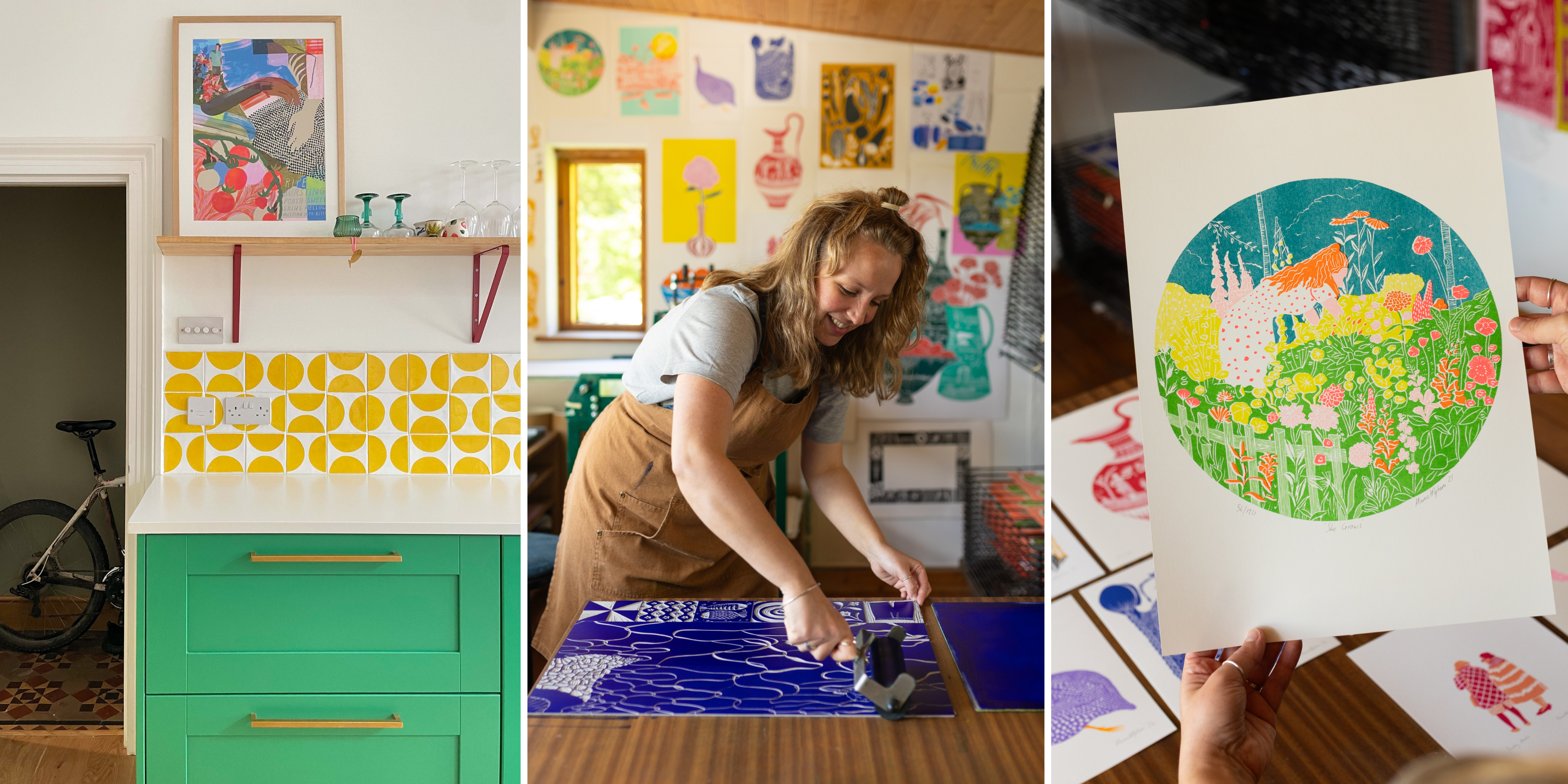
Over the years I’ve worked in a range of creative techniques. Embroidery, fine line drawing, digital illustration. I used to work on book projects and textile design but when I properly started making lino prints it changed everything. I fell in love with the process and It became possible to make a living solely through the prints that I wanted to create.
I first carved something just to play and I immediately loved the physicality of the process. I find the limitations strangely freeing, once you commit to the carving you are in.. no undoing with the click of a finger.
The carving is slow and calming and then the first rolling of ink on to all those carved details exciting, and that first peel back is (hopefully) super satisfying. I think any form of making with our hands is so beneficial, especially today.

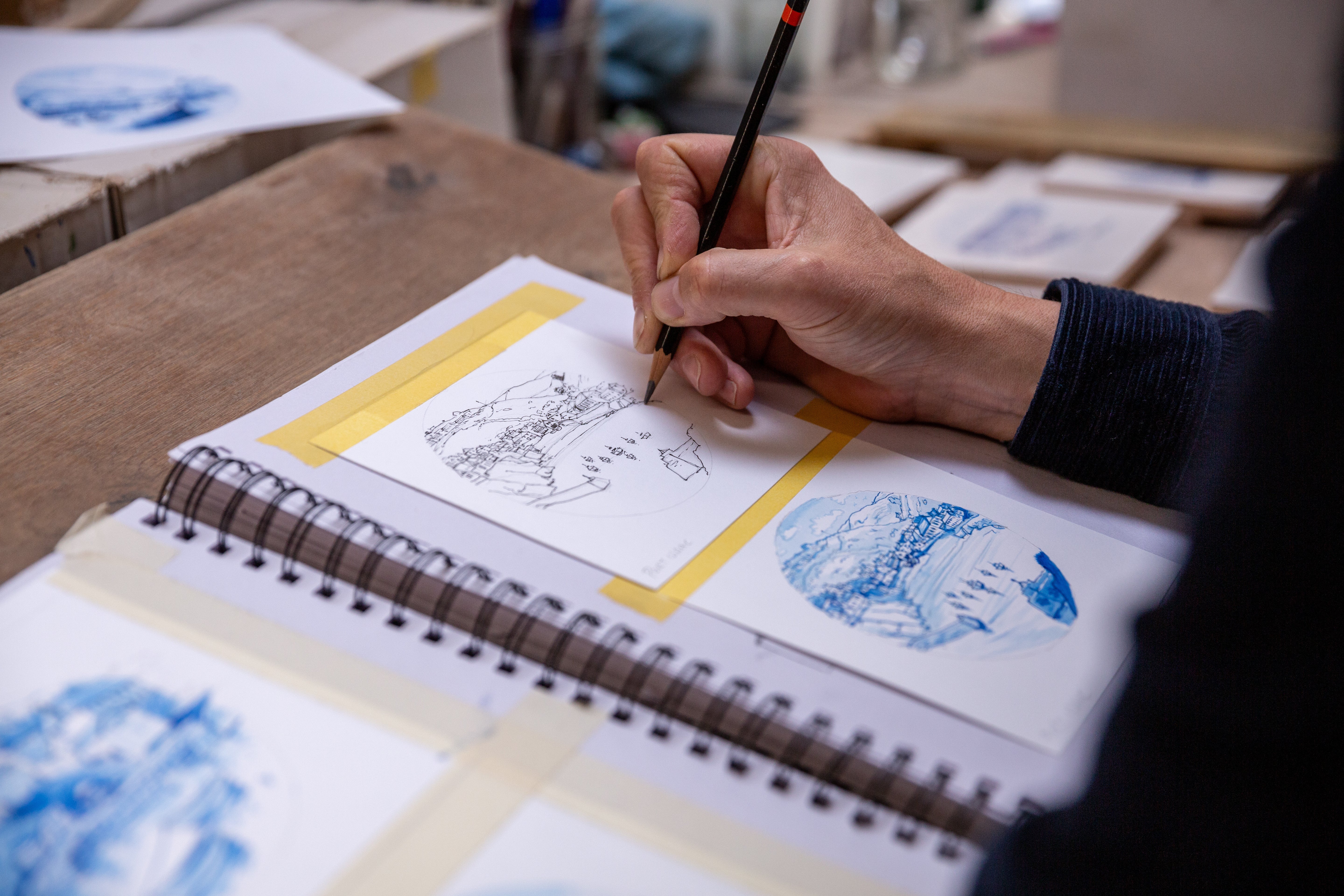
What inspires you and how do you start work on a new design?
The majority of my prints are inspired by places, trips to beautiful parts of the UK and Italy. The making process feeds into, and enhances, my experiences before I even begin. My work is often a response to a moment in time or a place which means when I’m in it I want to soak it all up - see it from every angle and visualise how I might piece it together as a print.

How do you go about decorating your home?
Our home is filled with art I love, prints, paintings and sculptures from other makers that spark joy.

A delightful head sculpture by Jim Pilston led to me painting this 2nd hand unit a matching buttercup yellow. This Lucy Shearston print celebrating tomatoes on the vine so beautifully felt like the icing on the cake of this space.

To stop the new kitchen feeling too much like everything matched I made a mosaic under our kitchen island with smashed up tiles. I wanted to create something that brought in different tones and textures. It took many, many hours but when the afternoon light hits it.. all worth it!

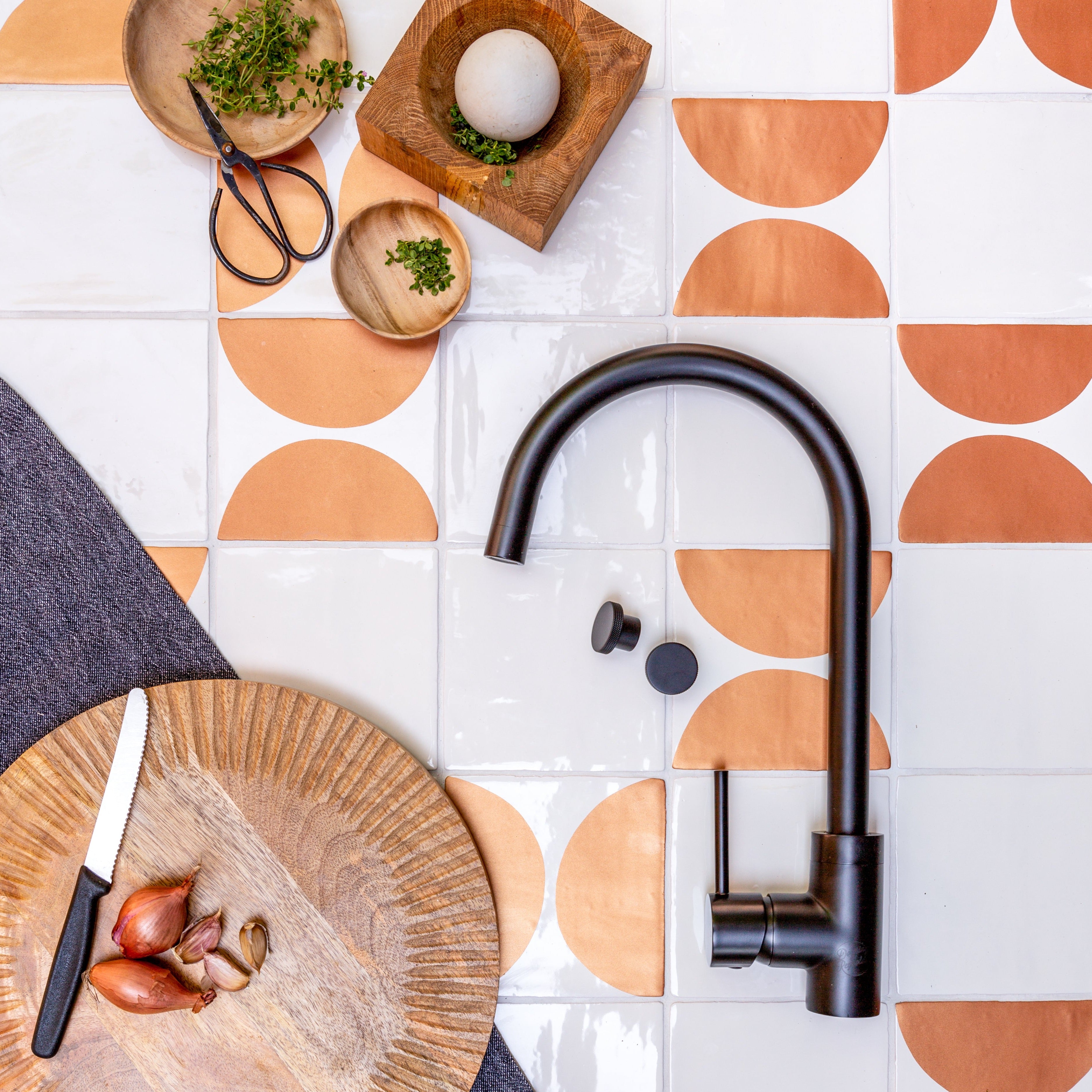
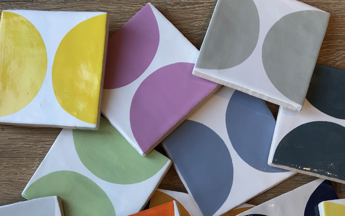
How did you find Decorum and choose your tiles?
I was looking for something bright and cheerful that would bring a fun element to our kitchen.. I didn’t want it to feel too sensible. I had searched through a lot of yellow and white tiles but often found the samples to be much more muted in colour... until I ordered samples from Decorum.
I immediately loved the lemon arc Cornish white tiles. My step Dad did the tiling and the space was completely transformed. They bring warmth and playfulness with their colour and the irregular patterns that you can form. I’m so happy with how they make our kitchen feel.
What exciting projects are you working on next?
I’m just about to finish a huge design I’ve been working on whenever possible since November!

The final design will be made of of 9 x A2 panels.. which will hang together as a grid. I’d been craving creating something where I could play with scale and not be limited by the size of my printing press. Whilst floating in the sea last year I decided I was gazing at the sort of view I’d like to depict. It has been wonderful being able to embrace and enlarge details of this scene such as light on water, right up to the top panels which depict palms and arched windows in dramatic contrast. The main design is surrounded by decorative tiles depicting the little and lovely moments associated with holidays in the sun.

This 9 panel piece will be exhibited for the first time at a group exhibition with 3 lovely print making friends in Bristol this Summer. (Centrespace Gallery - 23rd - 29th of August).

You can find process videos of the making of these prints on Instagram @harrietpopham and work for sale on Harriet’s website www.harrietpopham.com
Studio photos by Kathryn Anne Photography www.kathrynannephotography.co.uk