What is Pantone?
In the world of interiors and design, Pantone is king. We’ve all seen the name and to think of ‘Pantone’ is to conjure up a million and one colours – anything from the palest hue of cream to the most eye popping neon orange you can imagine. Pantone really is the world’s leading authority on colour.
But who, or what, is Pantone and how did they become the ones to decide what makes a colour, a colour?
We decided to lift the technicolour curtain and find out.

A potted history
Pantone started life in the 1950s as a small printing and marketing company in New Jersey, owned by the Levine brothers. In 1956 they hired Lawrence Herbert straight out of college, to work for them part time. Herbert quickly made a success of the ink and printing division by using his chemistry knowledge to systematise the pigments the company used to make coloured inks. However, a constant source of frustration was matching his clients’ ideas of what a colour might be, to his own – everybody has a slightly different take on what ‘deep red’ should look like or ‘sunshine yellow’.
The company – M & J Levine Advertising as it was called – also produced colour cards for cosmetics manufacturers, so that cosmeticians could talk about different coloured lipsticks by pointing to the card rather than opening every shade of lipstick. Herbert realised that a similar system could be used for commercial coloured ink. It was the first time colours had be put into any sort of single, shareable reference point. The original book of numbered colour samples had no more than 40 shades in it.
In 1962, Herbert bought out the Levine brothers and renamed the company Pantone. Once the organisation was his, he dedicated himself to turning it into the world’s leading authority on colours.
Pantone today
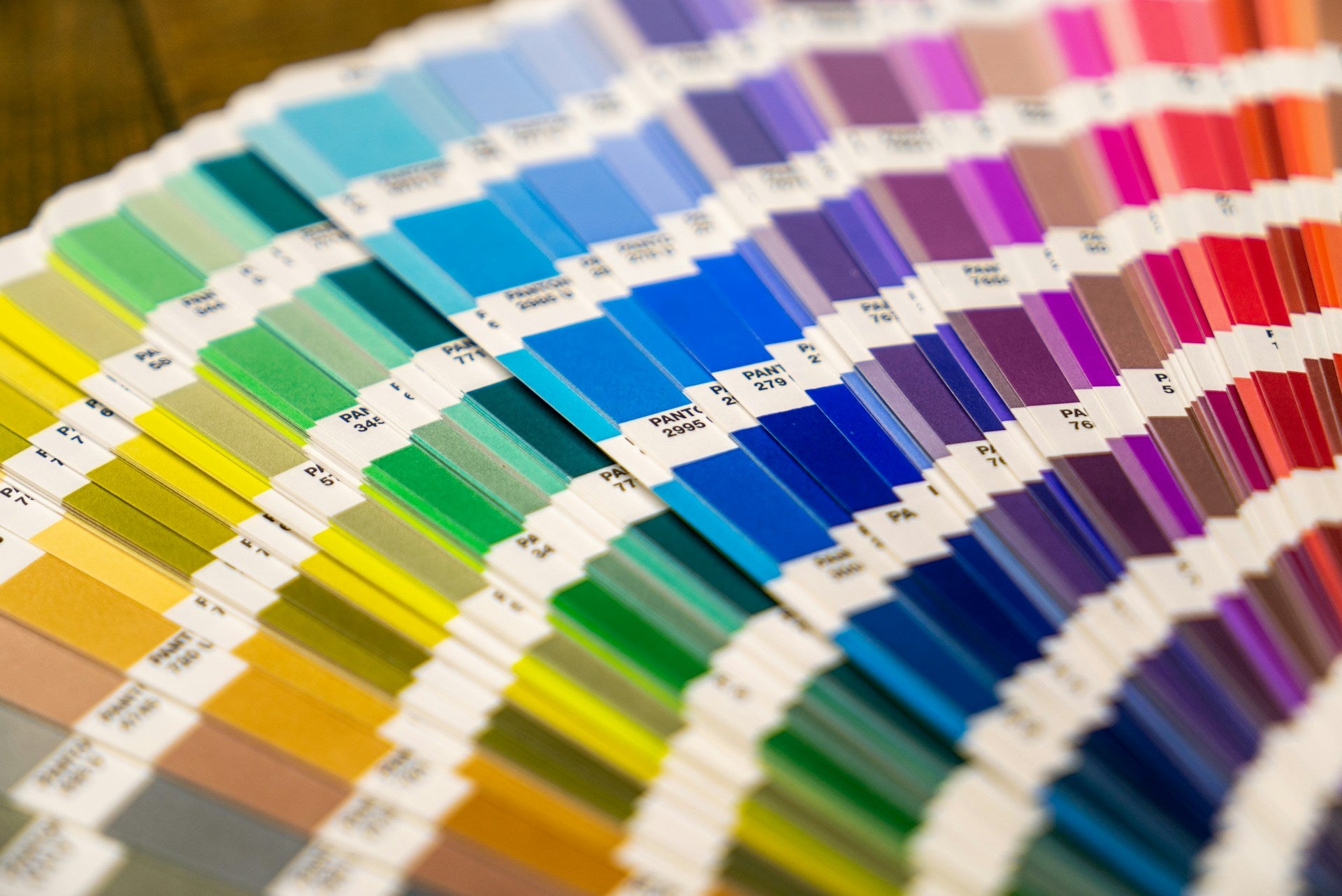
Along with the ever-expanding colour reference books, he introduced the Pantone Matching System “allowing for the faithful selection, articulation and reproduction of consistent, accurate color anywhere in the world.” – according to the Pantone website. In essence it means that anyone, anywhere, can be sure that they are discussing exactly the same colour with anyone and everyone else.
There are now over 3,000 individually identified colours in the Pantone book, each with their own unique reference number. Need a gentle peach? How about Pantone 169 #f9baaa. Or are you in the market for a really zingy green? Pantone 2421c #1ab500 should be right up your street.
The ease and precision with which you can communicate the exact colour you need is crucial to anyone working in design, manufacturing, fashion and any number of industries which use colour as part of their product - physical or digital.
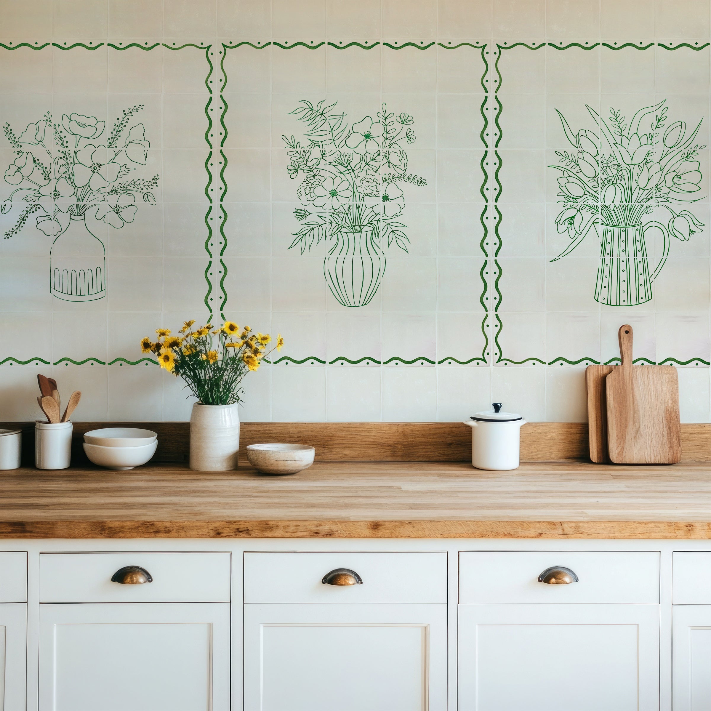
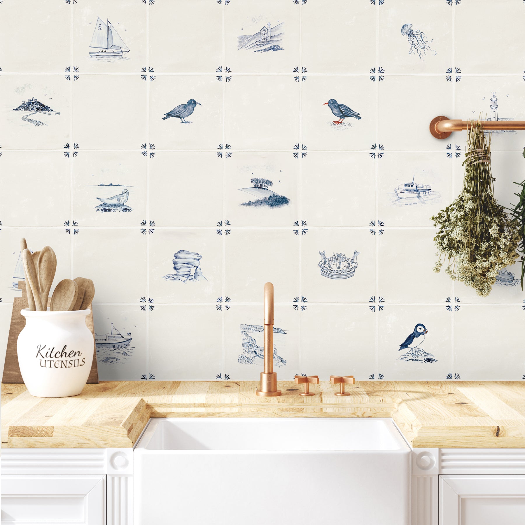
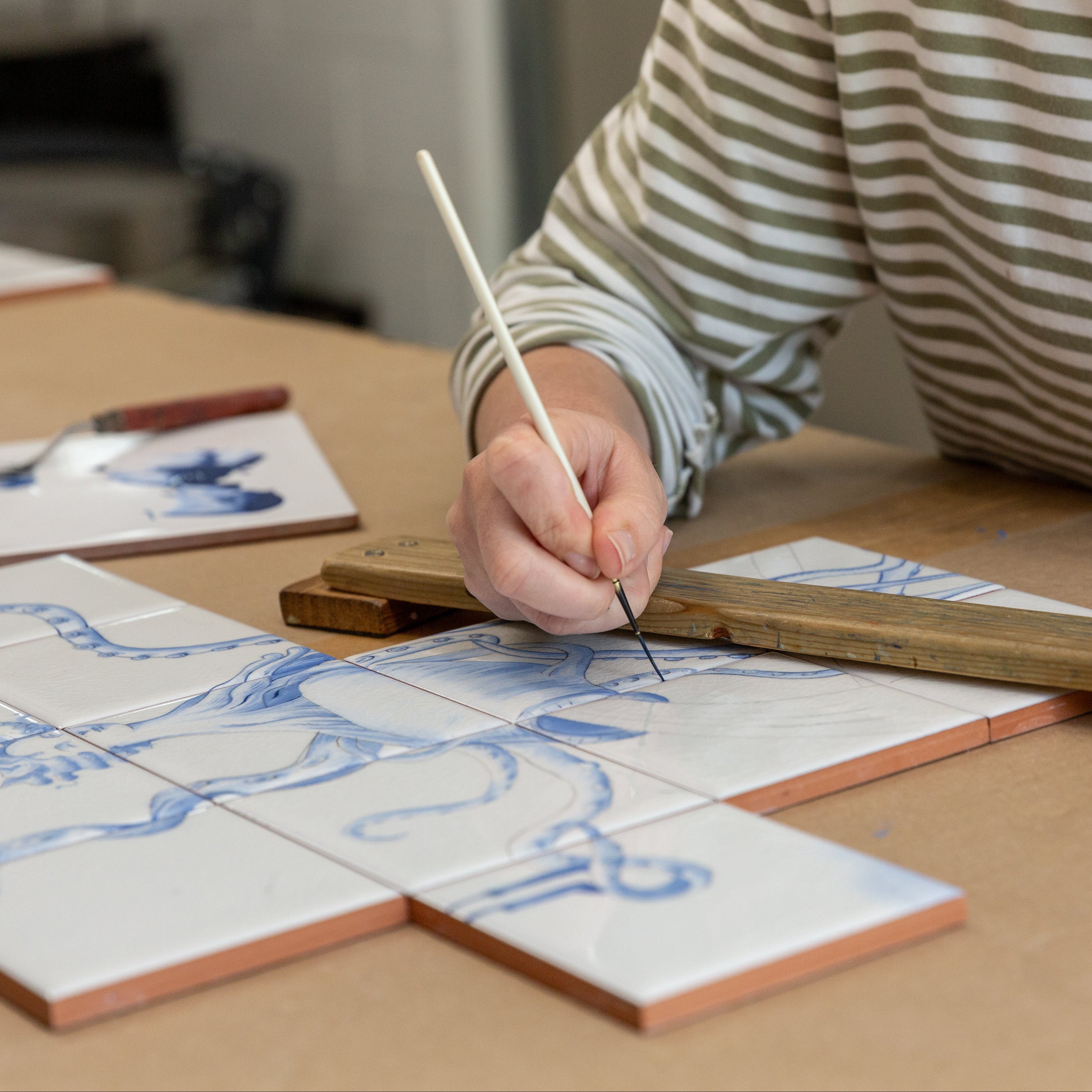
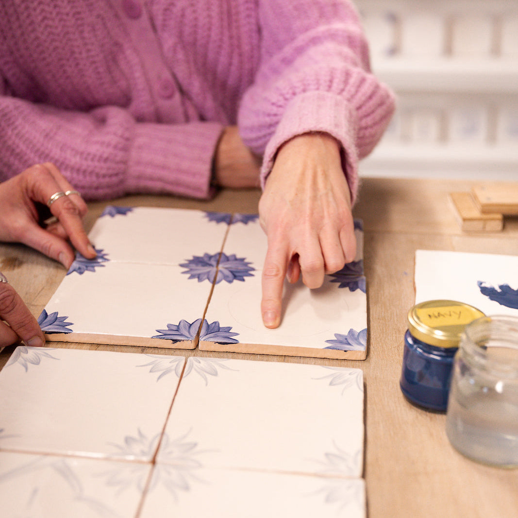
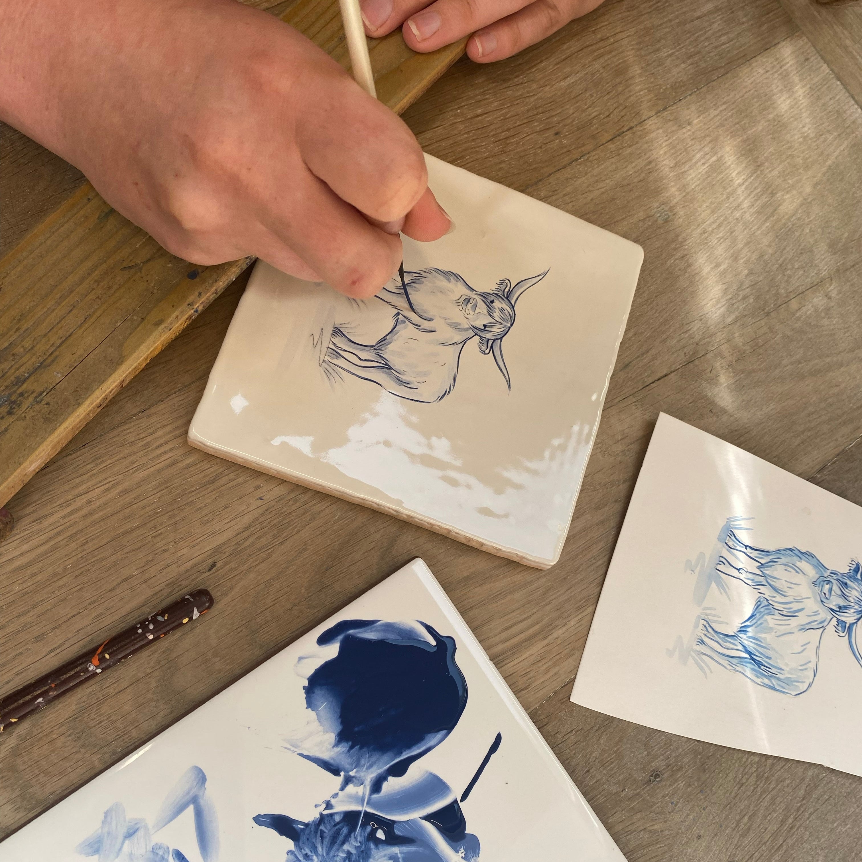
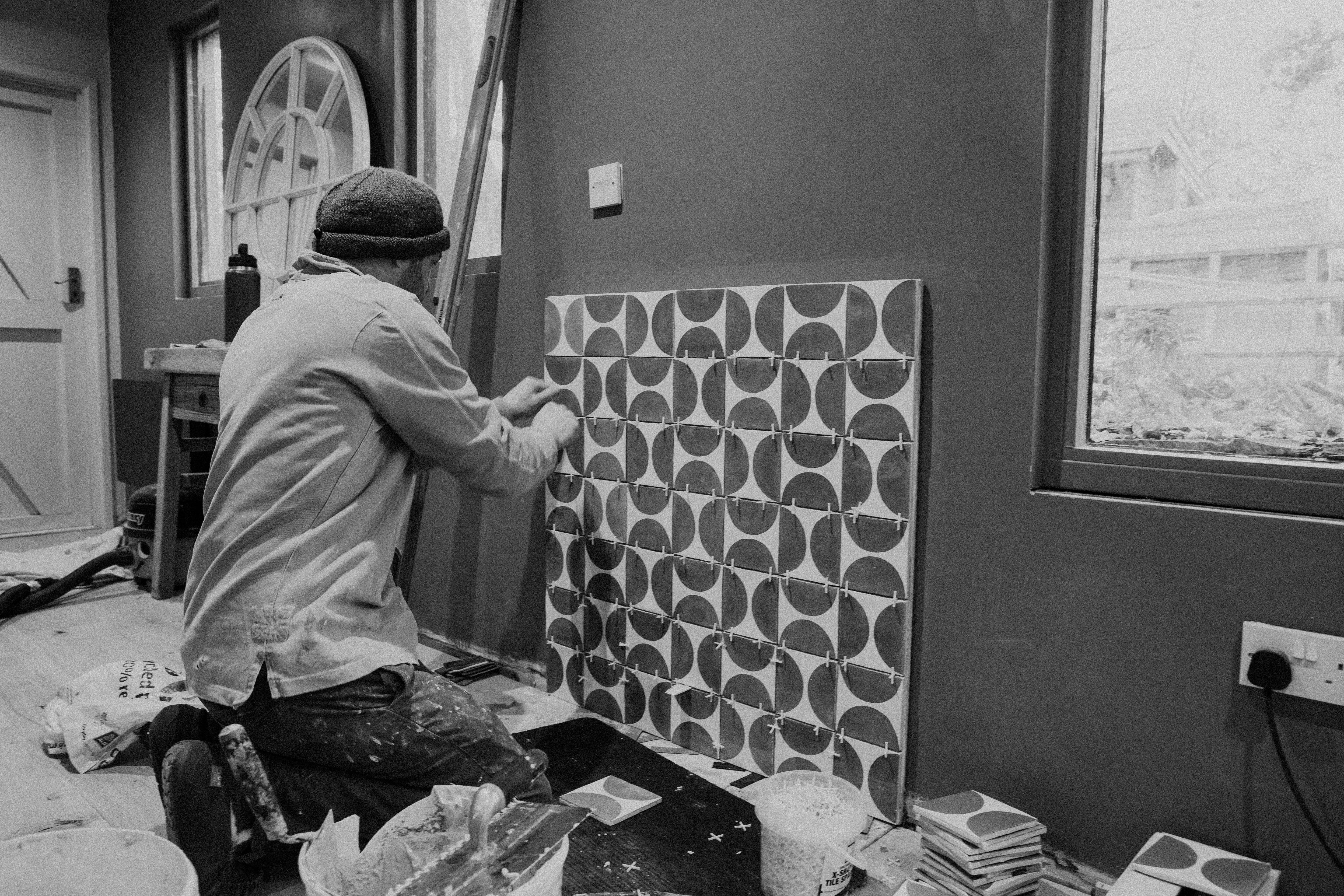
We in the interior design world rely on Pantone perhaps more than any other industry. We’ll use ourselves here at Decorum as an example. First and most importantly, we need to make sure that the whites used as a base on all our tiles is the same every single time – our Chalk white has a different reference number to our English white, and the Cornish white is different again. And just imagine if a palette full of an altogether different white turned up from the factory?! It would be chaos. We need to be sure that when we ask our suppliers for a specific colour then that is what we receive.
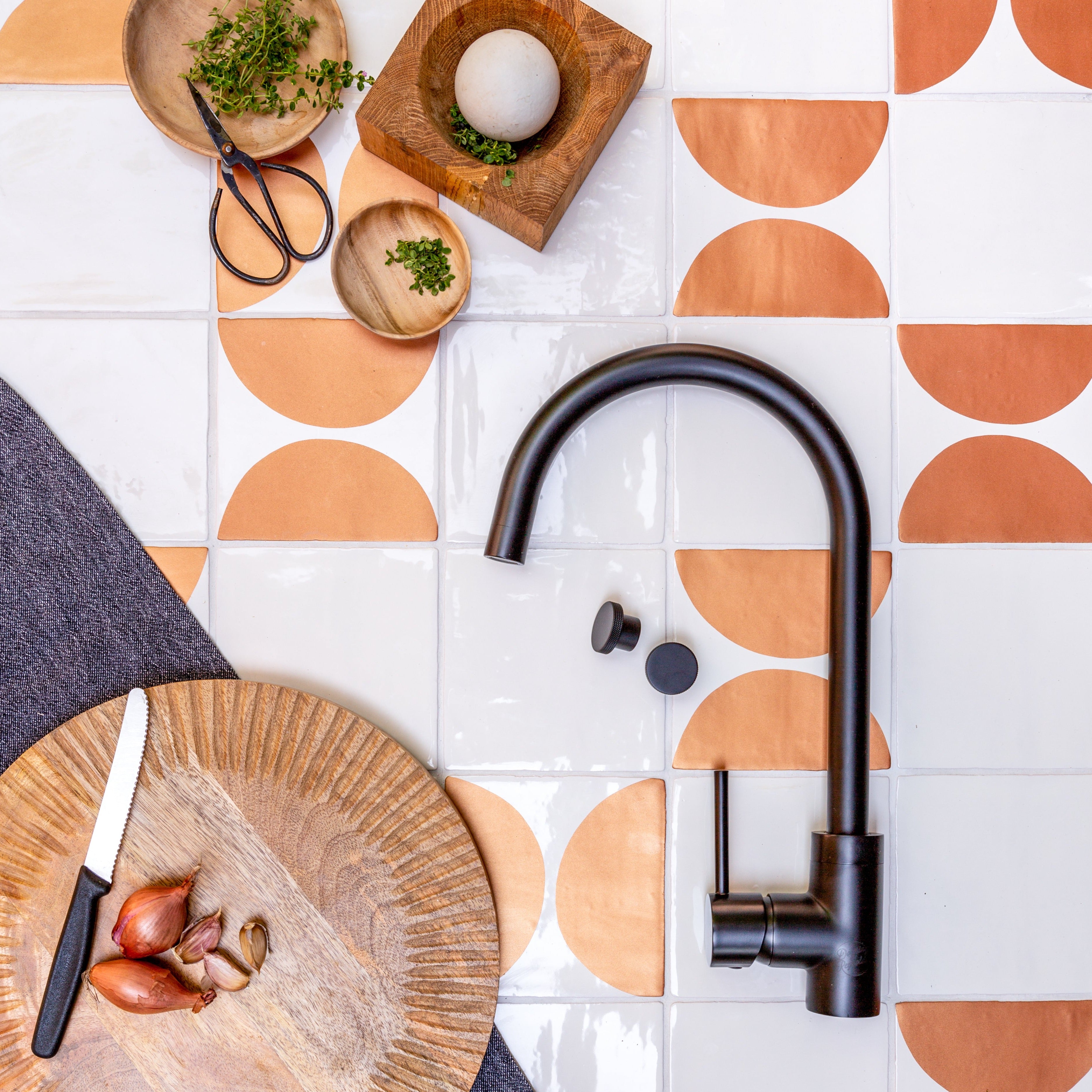
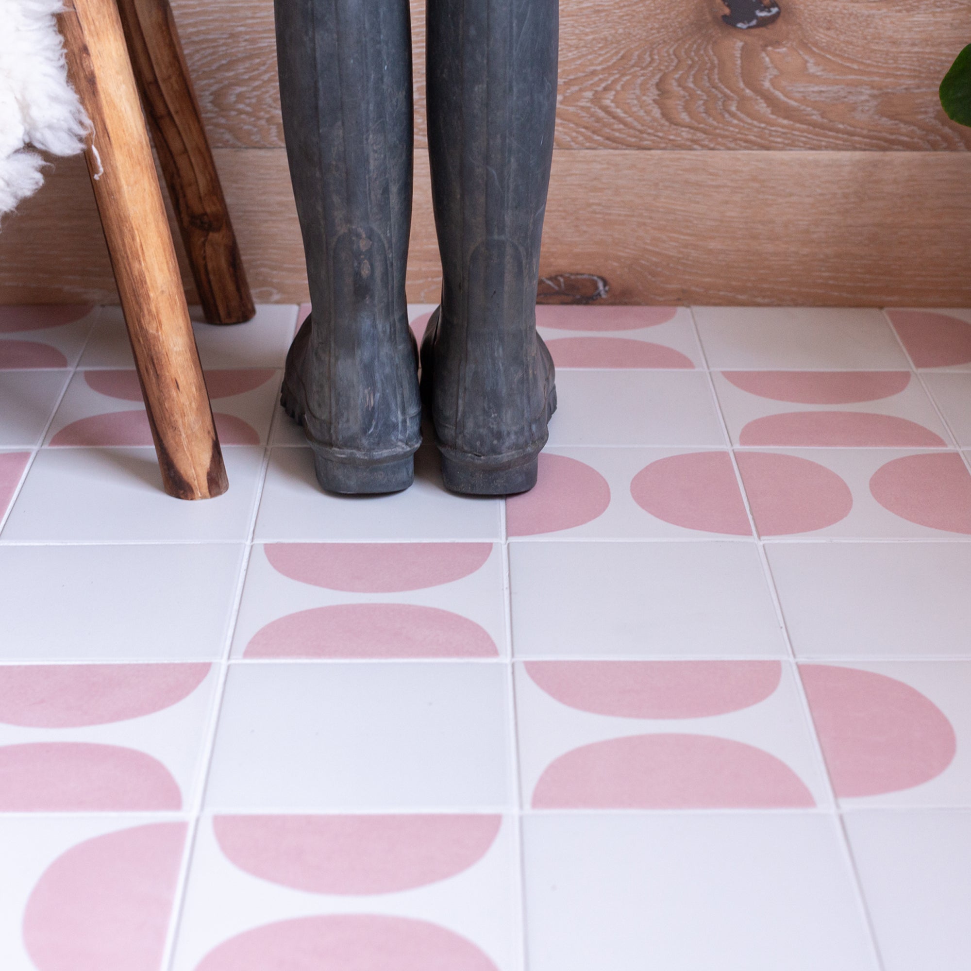
The same principle applies when ordering our paint pigments – we hand mix the paints in house to our own ratios, but the pigment we’re using has to be the same shade and intensity as the last time, and the time before that, otherwise our Satsuma Arcs might be wishy washy or our beautiful Delft blue might be on the purple side. Getting our colours wrong is possibly the worst thing that can happen to us when working on a customer’s order.

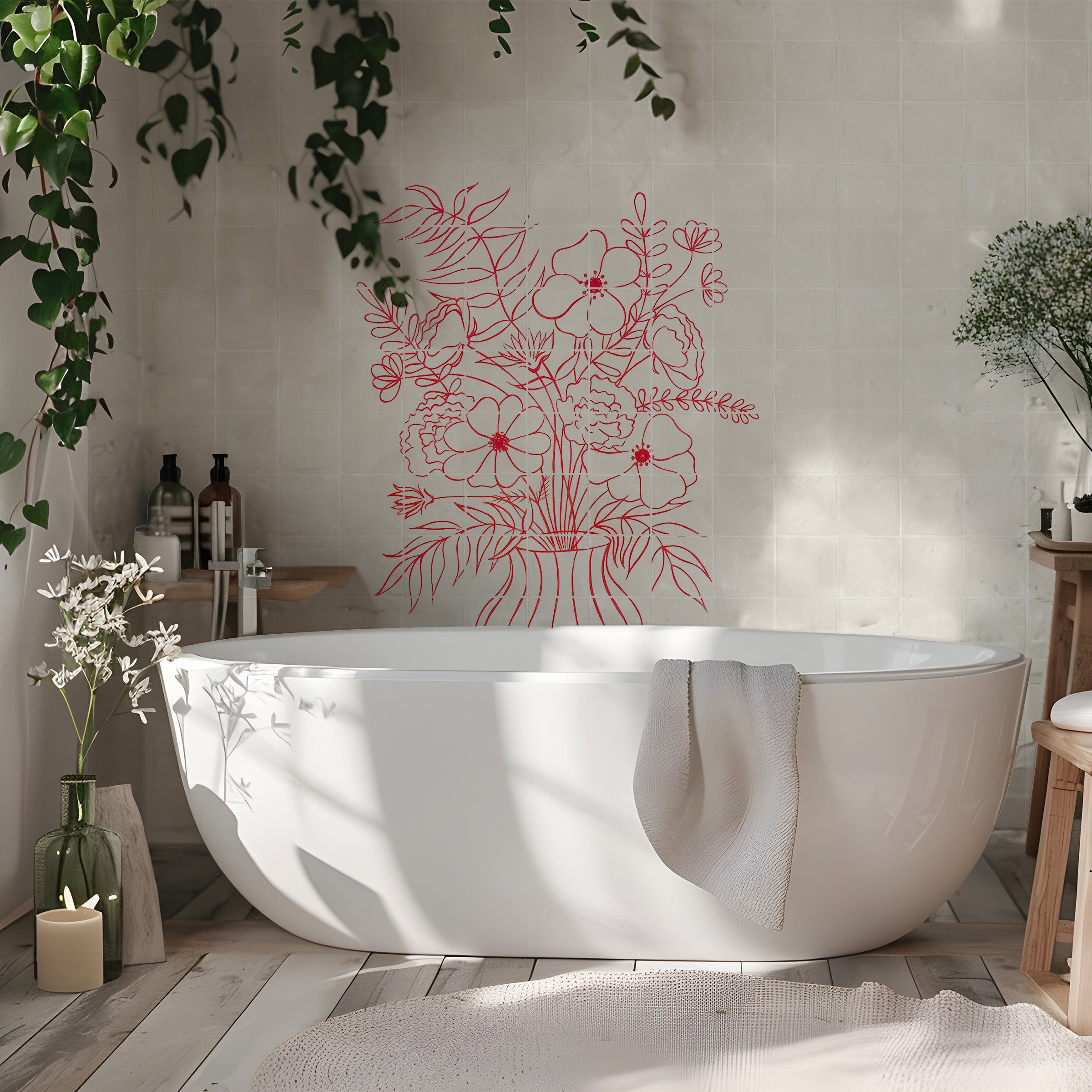
An exciting project that we have in the pipeline is colour matching the colours we create in-house to a specific Pantone reference number, allowing designers and clients to find the exact colour in paints or fabrics to match our tiles. It’s a huge undertaking and one that will need a very picky set of eyes, so will take a while to complete. It’s in the offing though as we know how useful this will be!
Colour is possibly the most subjective thing in the world as we all have our favourite. What we do know for certain though is that colour can make or break a mood, a room and even a meal! It has to be perfect. That’s why we work so hard to keep our Decorum colours the exact shade they should be, time after time and tile after tile.